
 Previous

At one point or another, you have probably seen a confusing data presentation. These typically include graphs that take too much time to understand. Or pie charts that are slivered down, making the smallest data all but impossible to read. Or a line chart that tries to include too many figures, ranges, and colors.
I train aspiring data analysts and scientists, and I see these mistakes all the time. Something I consistently emphasize is that data and numbers are a means to enhance a message or explain a complex situation. Data-driven insights can lead to powerful decisions and strategies in any organization.
Yet presenting numbers and data is a facet of public speaking that is often ignored. Just like words, numbers and graphs can be woven into compelling narratives to wow audiences and add serious logical weight to arguments.
Here are five principles to help you transform numbers into stories. I have used data from London’s main airport—Heathrow—and UNESCO to provide examples.
- Be Clear on Your Purpose
- Select the right visual.
- Remove the clutter.
- Engage with colors but don’t create rainbows.
- Use text to guide your viewers.
A good speech has only one purpose: inform, persuade, entertain, or inspire. The same is true of a strong graph or visual in a slide or report. Therefore, before you begin, ask yourself this crucial question: What am I using numbers for?
Are you providing specific information to your audience? Or do you have a call to action that requires persuading them? Or do you want to inspire them and raise awareness of an issue?
If your purpose is to inform, simple graphs may be sufficient. However, if you are looking to persuade or inspire, your visual must complement your message and leave no room for misunderstanding. Being able to genuinely move people requires knowing how to use the tools in the weird, wonderful, and colorful science of data visualization.
You can use a wide variety of methods to represent data visually. The most common ones are pie charts, line charts, and bar charts. However, visuals are not necessarily interchangeable and can convey very different meanings with the same data. Consider the example below, showing UNESCO sites by country from 2000 through 2025.
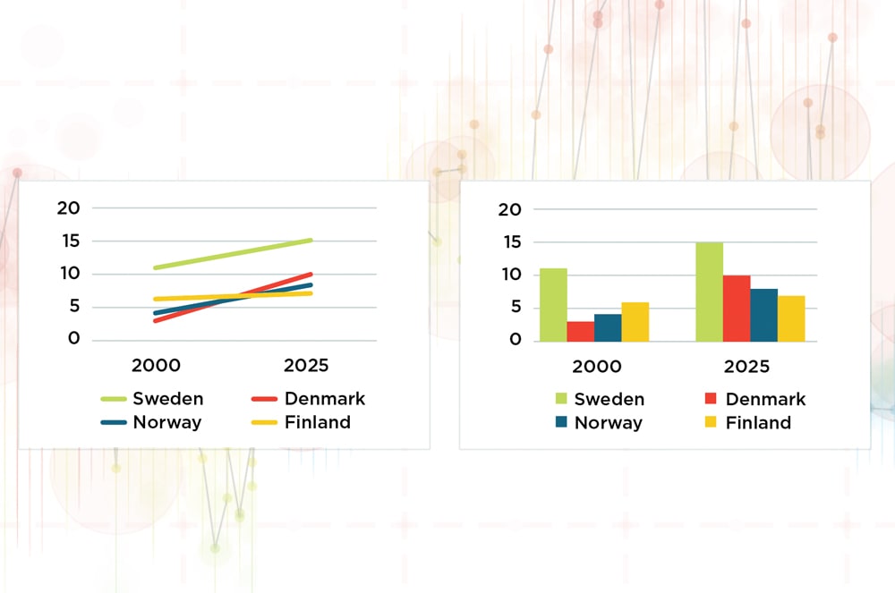
The two charts depict the same data but present it differently. The main message of the line chart on the left is that Denmark went from having the lowest to second-highest number of World Heritage sites between 2000 and 2025. But by using a column chart (on the right), the takeaway becomes that every country saw an increase in sites during that time frame.
Here are some helpful guidelines to help you determine what type of visuals to choose.
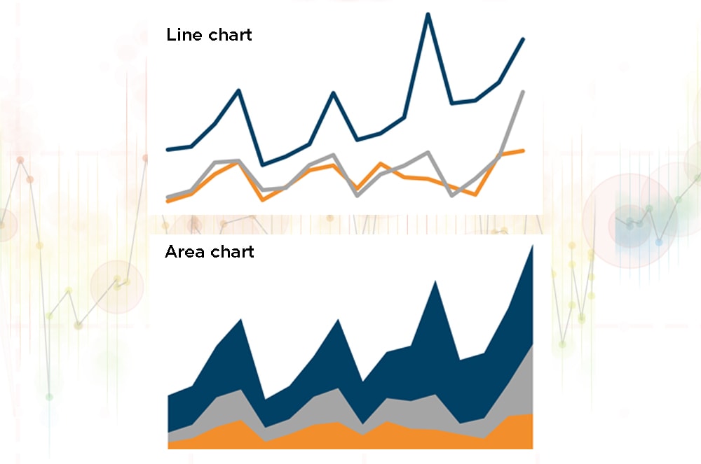
Want to chart time? Then use a line chart, which is best for showing trends. Area charts—line charts but with the area between the lines filled in with color—can also be useful, especially to show how proportions evolve over time.
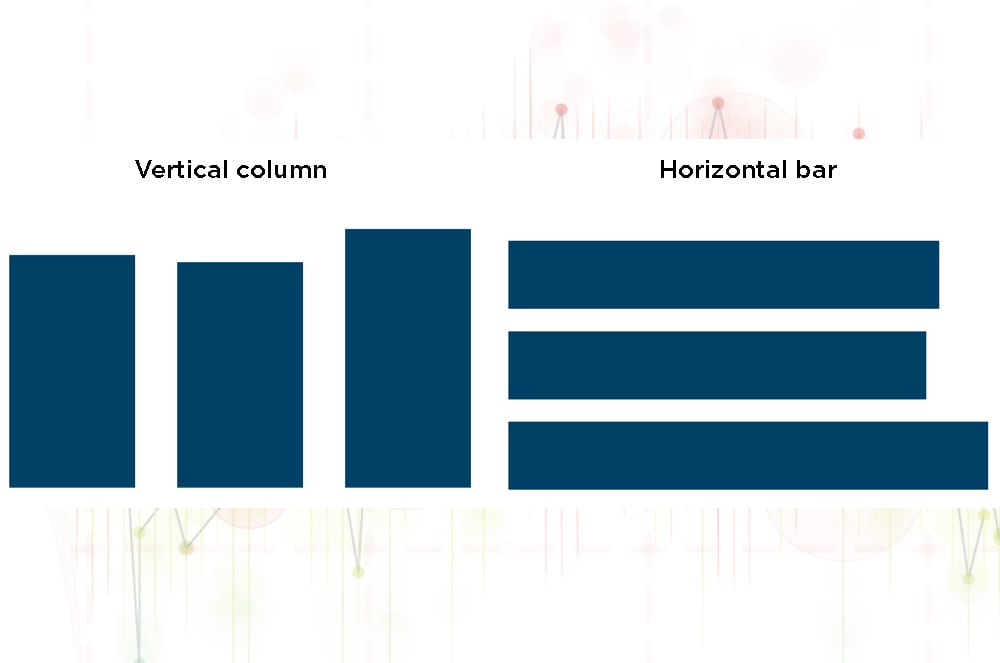
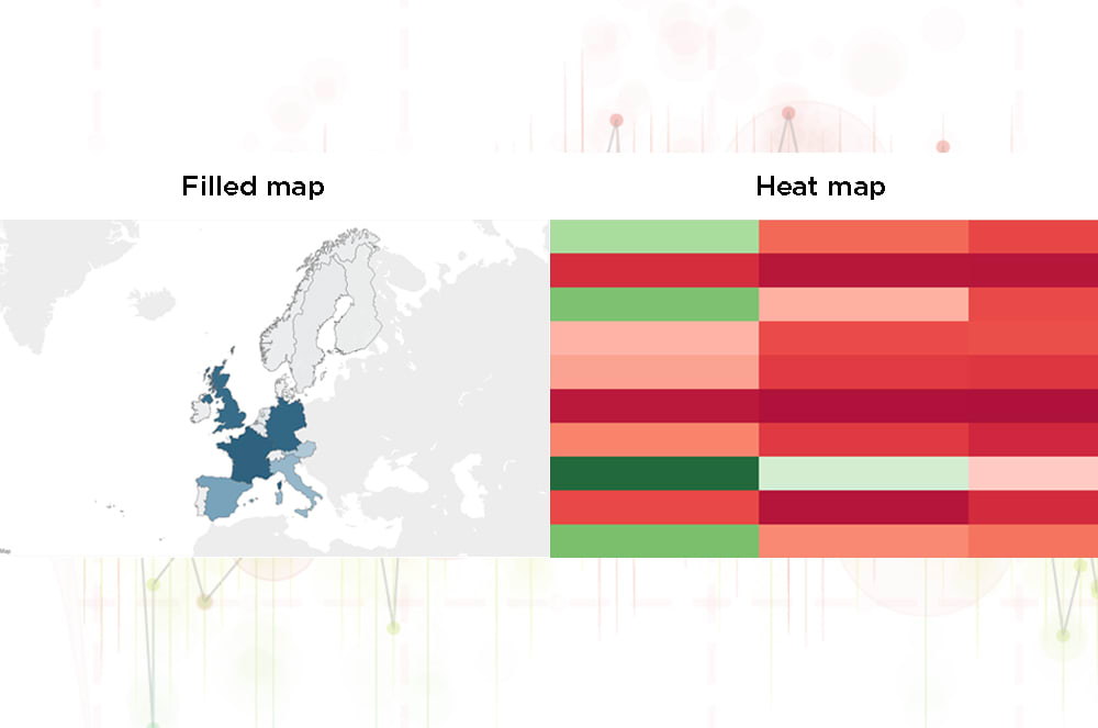
Comparing categories? Then your best friends are charts with vertical columns or horizontal bars. If your categories are geographical, then filled maps (which use shading or tinting to display the value belonging to a region) or heat maps (which represent a range of values depicted by color) can be immensely useful.
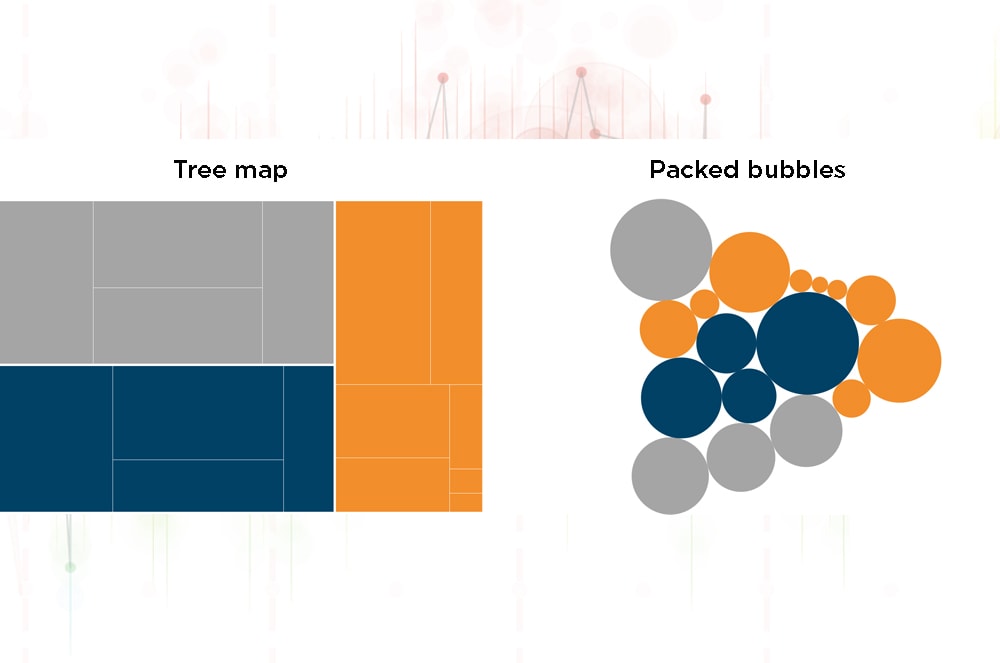
Visualizing proportions? Then use a pie chart, but only if you’ve got two or three slices to share; any more than that and the proportions get hard to interpret. Stacked bar charts can also be useful. Fancier ways of comparing the proportions of many variables include tree maps and packed bubbles charts.
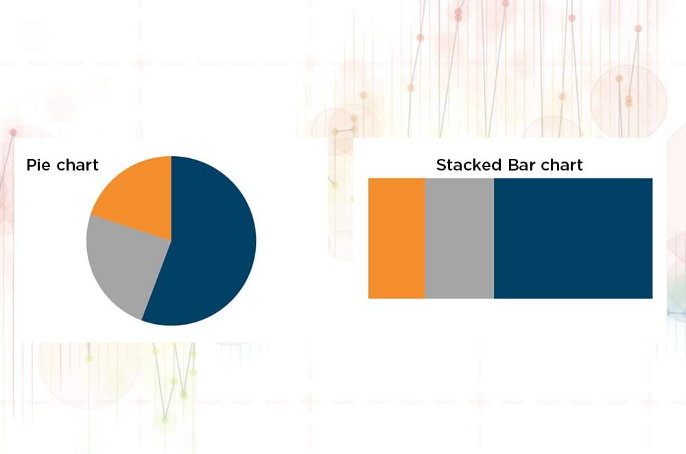
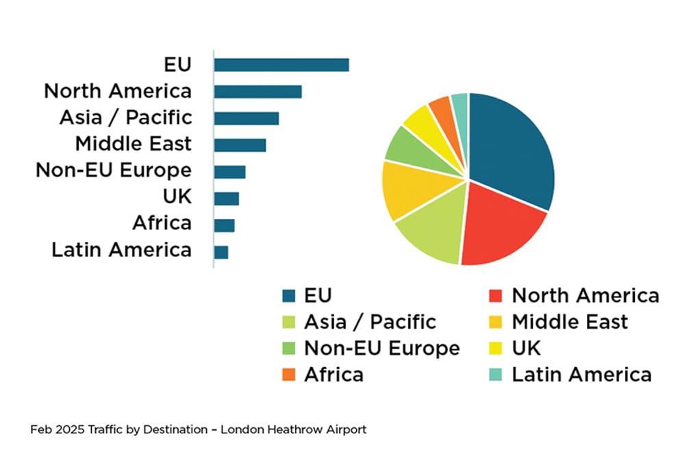
You can see below how a bar chart is much easier to interpret than a pie chart when comparing a large variety of data.
The most common mistake I see people make when presenting numbers is to use the default functions of their software tool. The automatically generated axes, values, colors, and lines often result in clutter and unimpactful graphs.
Do you need to keep horizontal lines? So many 000s? To label every data point? Do you even need to keep axes on your graph, especially if you’re adding labels to your chart? Let’s compare these two graphs below and determine which one is easiest to interpret and understand.
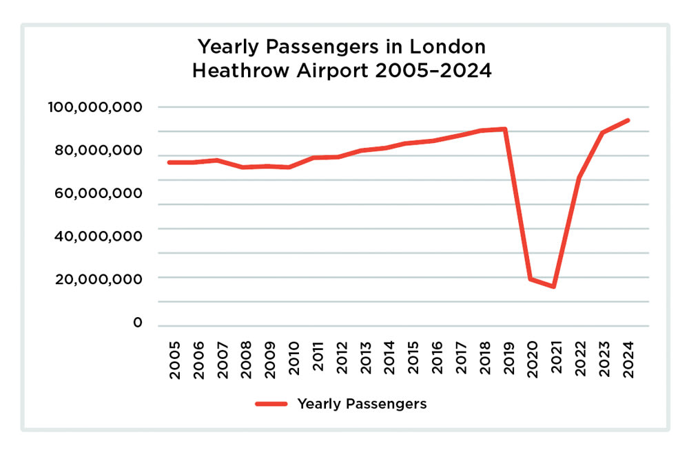
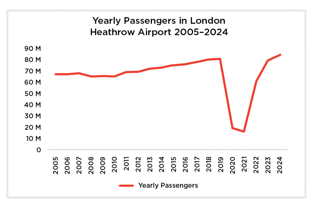
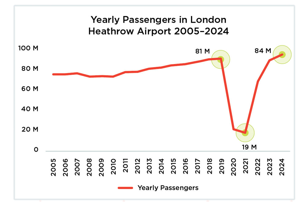
The second graph is easier to understand because the long numbers on the left column are simplified, with an “M” representing “million.” If desired, you can add some elements back to emphasize your point. In the example below, I’ve added the figures directly on the lines, so people can easily see that this airport’s passenger traffic is now back to pre-pandemic levels.
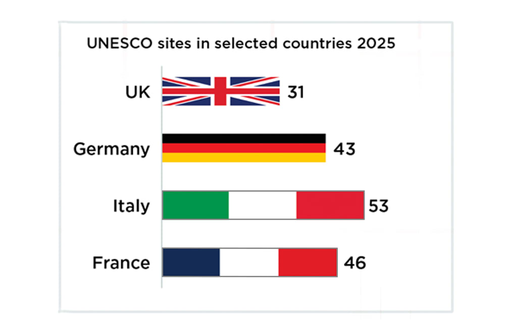
Colors can make a piece of data visualization more engaging, but a graph needs to strike the right balance between beauty and function. There is no need to color every bar in a bar chart differently, especially when they are labelled individually.
Below, you can see how adding color and images to a simple bar chart makes it more difficult to interpret. Storytelling with numbers is not about creating rainbows!
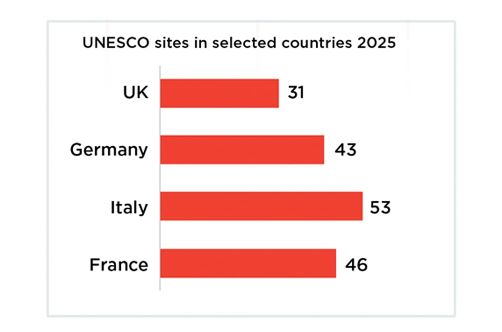
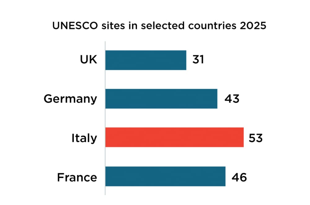
That said, color can play an important role in emphasizing what information could be of interest to the viewers. The information needed for comparison can be pushed to the background, with color used to highlight the interesting points. For instance, a quick glance at the chart below shows that Italy is the country with the most World Heritage sites.
The last ingredient of data storytelling is using text itself to guide viewers and emphasize a clear message. This can be done either by adding text directly into your visuals, or by using a narrative-driven title to tell a story. In the example below, I also leveraged color to emphasize a time frame relevant to the narrative used in the title. Finally, I added numbers above the graph to further emphasize the message.
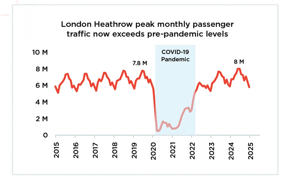
Can you see how it’s more engaging to show the information visually than to simply say, “Monthly passenger traffic in London Heathrow went down dramatically during the pandemic, but now exceeds pre-pandemic levels”?
So, the next time you need to present data, consider the best way to depict it.
You have abundant options—from line charts to pie charts, bar charts, and many more. Pick the one that best underscores your point and that conveys your message quickly and in an interesting manner.
Data doesn’t need to be boring! And it shouldn’t be hard to interpret. Graphs and charts break up a presentation or large chunk of text. It’s much easier to grasp something presented visually than to read or listen to a long explanation.

Share this article
Florian Bay, DTM is a Past District 91 Director and a member of London Victorians Toastmasters in London, United Kingdom.
Related Articles

Presentation Skills
5 Basic Tips for Effective Slide Presentations

Presentation Skills
Give a Sales Pitch With Purpose

Communication